As you've probably gathered, Brentford Football Club are very close to my heart. In November 2016 they announced their new club crest / badge.
I thought the following snapshots from their official website are quite interesting.
The first one shows the previous club crests, dating all the way back to 1893.

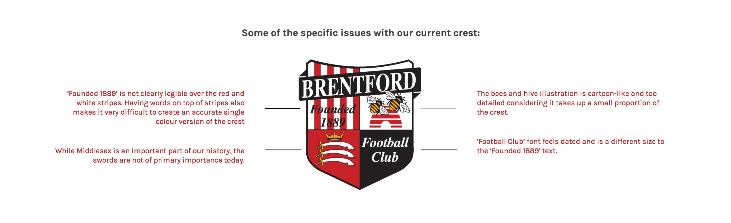
The next one goes on to show what was considered wrong with the incumbent badge in this day and age. Part of it was because of the digital aspect - how it didn't fit with the demands of the various forms of digital media.
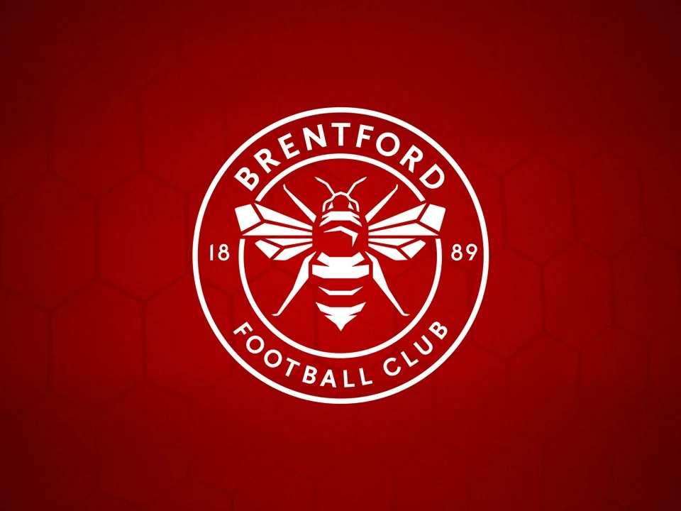
Finally, I guess you're now interested to know what the new crest looks like? Well there are a couple of versions floating around, and this red and white one is my favourite at the moment.
It will be interesting to see how the new crest is received by the fans. Although the incumbent crest wasn't the most striking, there is the familiarity aspect.
Most fans seem to be focusing on the number of legs of the imaged bee, and the fact that it resembles a wasp. For me, I like it but feel that it was a shame they couldn't incorporate the iconic red and white stripes.